
A brand mood board is a single visual reference that collects the colors, imagery, typography, textures and words that describe the direction your brand should move in before anything is finalized. It is the step between "we need a new look" and "here is your finished identity."
Designers have used mood boards for decades for one reason: it is far cheaper to disagree about a collage than about a finished logo. A mood board gets everyone looking at the same reference images and saying "more like this, less like that" before weeks of design work are spent on the wrong direction.
This guide covers what a brand mood board is, exactly what to include, a five-step process for building one, a template layout you can copy, and three worked examples for different kinds of brands.
What Is a Brand Mood Board?
A brand mood board is a curated collection of visual references: photographs, color swatches, font samples, textures, patterns, and short descriptive words, arranged together to communicate a brand's intended feel. It answers the question "what should this brand look and feel like?" without yet answering "what is the final logo?"
The mood board is the earliest, most directional brand document. It comes before the brand book (the rules) and the brand kit (the files). You use it to align on direction, then design the identity, then document everything.
Mood board vs. brand board vs. brand guidelines
These terms get mixed up constantly:
- Mood board: inspiration and direction. References you found, not things you made. Its job is to provoke a reaction.
- Brand board: a condensed snapshot of the finished identity: final logo, final palette, final fonts on one page. Its job is quick reference.
- Brand guidelines: the full rulebook for applying the finished identity. Its job is consistency over time, and it works best as living guidelines rather than a PDF.
A mood board is made of other people's images and rough swatches. A brand board is made of your own finished assets. If a client is expecting one and you deliver the other, you will have an unhappy client, so agree on which one a project actually needs.
What to Include on the Board
A useful mood board is selective, not exhaustive. Ten to twenty well-chosen references beat fifty loosely-related ones. Include:
1. Imagery (the biggest section)
Photographs that capture the world your brand lives in. For a coffee roaster: origins, roasting, hands, morning light. For a B2B software brand: the work your customers do, the calm of a well-run team, the opposite of chaos. Aim for mood, not subject matter: the lighting, energy and composition are what communicate.
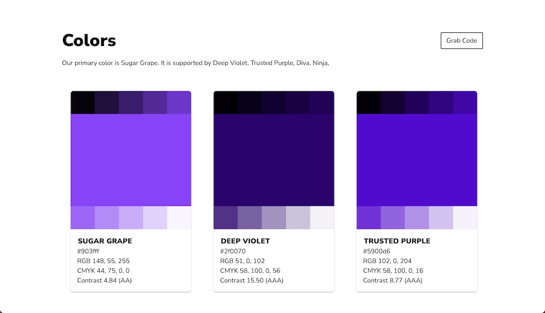
2. Color direction
Rough swatches or pulled color palettes, five to eight at most, shown next to the imagery so the relationship is visible. You are not picking final hex values yet; you are saying "warm and earthy" or "cool and precise."
3. Typography samples
Two or three typefaces (or style references: "geometric sans," "high-contrast serif") shown at real sizes. Include a headline sample, not just the alphabet, because mood lives in how type behaves in use.
4. Texture and material
Paper, wood, stone, fabric, grain, print finishes. Textures do a lot of silent work in a mood board: the same palette reads completely differently against matte concrete than against soft linen.
5. Tone words
Three to five words the brand should feel like: "confident, plain-spoken, warm" or "precise, quiet, technical." Put them on the board itself. They anchor every later decision, from copy voice to design feedback.
6. A few anti-references
Optional but powerful: one or two images of what the brand is not. "Not neon, not playful, not corporate." Negative direction prevents more missteps than positive direction alone.
Building It in 5 Steps
Step 1: Collect without judging
Gather everything that might be relevant: competitor screenshots, photography, magazine scans, screenshots of brands you admire, color combinations from nature. Don't edit yet. Volume first, taste second.
Step 2: Write the tone words first, images second
It feels backwards, but deciding "warm, handmade, unhurried" before arranging images gives you a filter. When two images conflict, the tone words break the tie.
Step 3: Cut to ten to twenty references
Remove anything that only made the pile because it is pretty. Every item should earn its place by communicating the direction. If you cannot say what an image contributes, it is decoration.
Step 4: Arrange with hierarchy
Put the dominant mood in the center at the largest size, and let supporting references sit around it. Group color and type together so the pairing reads as one system. A mood board with no hierarchy looks like a Pinterest dump and gets treated like one.
Step 5: Test it on someone who hasn't seen it
Show the board to someone outside the project and ask what the brand feels like. If their answer matches your tone words, the board works. If they say "cozy" and you wanted "premium," the board has told you something before the logo did.
A Brand Mood Board Template You Can Copy
If you are searching for a brand mood board template, this is the six-zone layout we recommend. It is a structure you can rebuild in any tool, or run as a board in a DAM like Baseline where every reference stays linked and commentable:
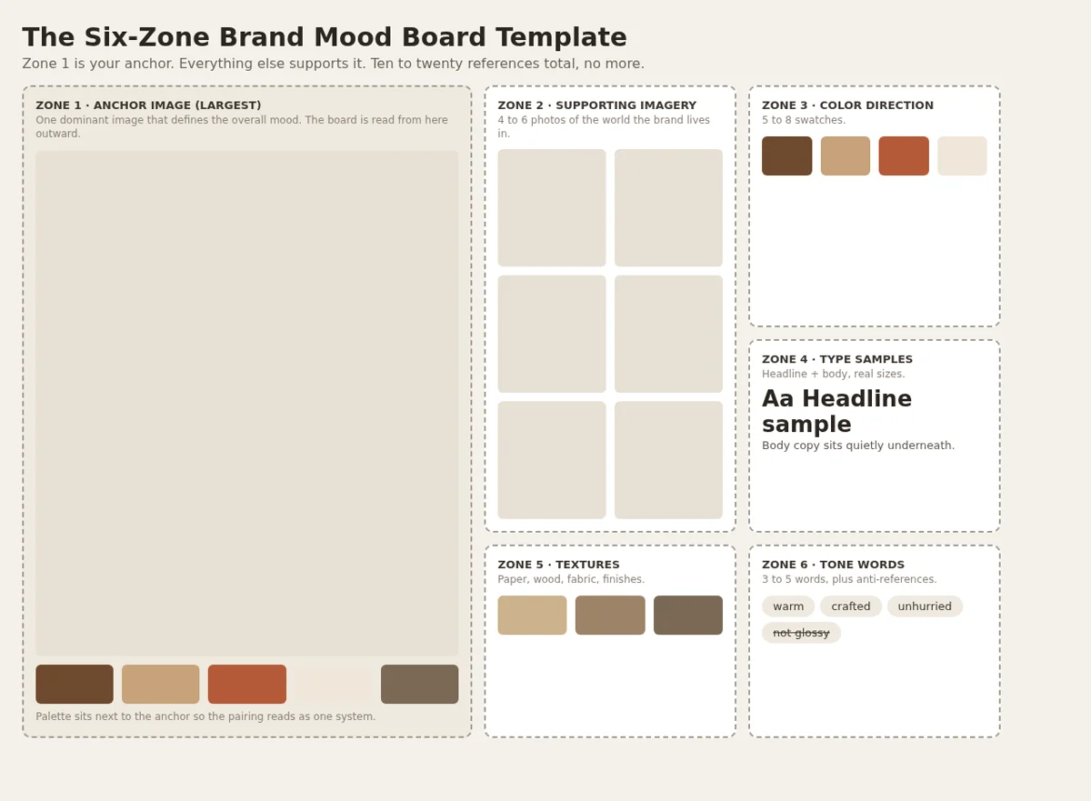
Download the six-zone mood board layout (PDF)
- Zone 1, center (largest): the anchor image that defines the overall mood
- Zone 2, left: four to six supporting images showing the brand's world
- Zone 3, top right: the color direction, five to eight swatches
- Zone 4, bottom right: typography samples, headline weight plus body weight
- Zone 5, bottom left: textures and materials
- Zone 6, corner (small): the three to five tone words, plus any anti-references
Build it on a board where others can comment directly on the images: mood boards fail when feedback happens in a separate email thread. Baseline's boards support commenting and annotation on each reference, and when the direction is approved, the same board becomes the seed of your asset library. If what you actually need is a finished brand guide template rather than a mood board, use the brand guide template picker instead.
Brand Mood Board Examples
Three worked examples showing how the same six-zone template changes with the brand.
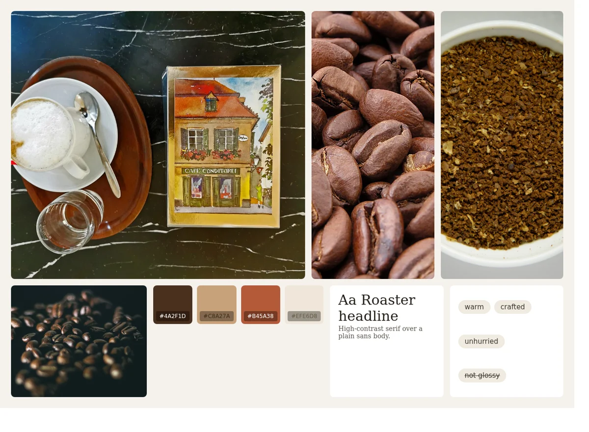
Example 1: Artisan coffee roaster
Artisan coffee roaster: warm, crafted, unhurried.
- Tone words: warm, crafted, unhurried
- Anchor image: a café table in warm morning light
- Supporting images: roasted beans, grounds in a bowl, beans scattered on a surface
- Colors: espresso brown, cream, burnt terracotta
- Type: a high-contrast serif for headlines, a plain sans for body
- Textures: kraft paper, unglazed ceramic, burlap
- Anti-reference: anything neon or glossy
Example 2: B2B project management software
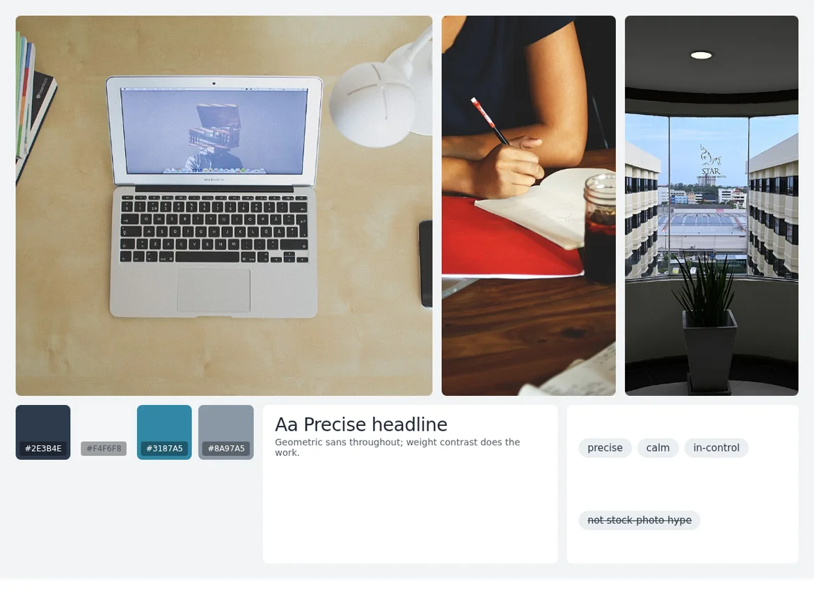
B2B software brand: precise, calm, in-control.
- Tone words: precise, calm, in-control
- Anchor image: an open laptop on a tidy desk, natural light, no clutter
- Supporting images: a coffee-and-notes workspace, a calm window view
- Colors: deep slate, off-white, one restrained accent color
- Type: a geometric sans throughout, weight contrast doing the work
- Textures: minimal; matte surfaces, soft shadows
- Anti-reference: stock photos of people celebrating in meetings
Example 3: Fashion label for a younger audience
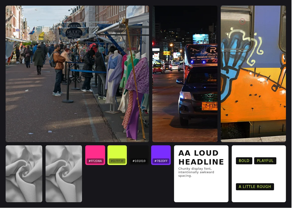
Youth fashion label: bold, playful, a little rough.
- Tone words: bold, playful, a little rough
- Anchor image: street life in bright daylight, market energy
- Supporting images: a neon-lit street at night, graffiti, denim textures
- Colors: saturated pink, acid green, black
- Type: a chunky display font with intentionally awkward spacing
- Textures: denim, photocopy grain, sticker slaps
- Anti-reference: pastel minimalism
Notice that none of these boards contains a logo. A mood board is the direction the logo must later fit inside.
From Mood Board to Brand Guide
The mood board is the first document of a longer pipeline:
- Mood board: agree on direction (this page)
- Identity design: logo, final palette, final type
- Brand board and kit: collect the finished files so people can use them (brand asset management)
- Brand guidelines: document the rules, kept alive rather than exported to a dying PDF
- Brand portal: give teams, clients and vendors self-service access to it all (what is a brand portal)
Teams that keep step 1 and step 5 in the same system avoid the classic failure: the mood board lives in a designer's laptop folder, the finished assets live in a shared drive, and nobody can trace why the brand looks the way it does. When your mood board becomes the first board of the brand's asset library, every later decision has a reference point. Baseline is built around exactly this: nested boards that go from raw inspiration to published, living brand guidelines without the files ever leaving one place.
Related reading: if you are moving from direction into production work, a creative brief template is the document that turns an approved mood board into an actual project.
Common Mistakes
- Too many references. Fifty images means no direction. Cut to twenty.
- Skipping the tone words. Images alone invite misreading; words anchor interpretation.
- Using finished logos from other brands. A mood board full of other companies' logos anchors everyone to existing designs instead of your direction.
- No hierarchy. Equal-size images in a grid read as "nice pictures," not as a brand position.
- One mood board for a multi-brand business. An agency with several clients needs one mood board per brand. Keep them in separate boards, the same way you keep client assets separate.
- Treating it as disposable. The approved mood board is a permanent reference. When someone asks "why is our palette so warm?" six months later, it is the answer.
Frequently Asked Questions
What is a brand mood board used for?
A brand mood board aligns everyone on a brand's visual and emotional direction before design work starts. It collects colors, imagery, typography, textures and tone words in one reference so feedback happens early, while changes are still cheap.
What's the difference between a mood board and a brand board?
A mood board contains reference material chosen to express a direction, usually before the identity exists. A brand board is a one-page snapshot of the finished identity: final logo, palette and fonts.
How many images should a brand mood board have?
Ten to twenty. Enough to cover imagery, color, type and texture with a clear hierarchy, few enough that every item is there for a reason.
Should a mood board include our logo?
No. A mood board is direction, not deliverables. Your own logo anchors the board to what already exists, and other brands' logos anchor it to their identity. Keep the board at the reference stage; the logo comes after direction is agreed.
Can I make a brand mood board online?
Yes, and for teams it beats a physical board: references stay attached to the project, comments land on the images themselves, and the board can later hold the finished brand assets too. Baseline's boards support gallery view, comments and annotations on every plan, including the free plan; sharing a board with a client starts on the Starter plan.
Get Started
Start with the direction, not the files. Build your mood board on a Baseline board, invite the team to comment on the references directly, and when the direction is agreed you're already standing in the first room of your brand library. Start free, no trial countdown.
Example board photography: "Cafe Konditorei Ullmann" by Ferry Paur, "Roasted coffee beans on the surface. 01" by A S M Jobaer, "Busy city street at night" by Pattaya Patrol (CC BY-SA 4.0); "Coarsely grounded coffee beans in white bowl" by Alorin (CC BY 4.0); "DZ6 0473 viewing nook" by PattayaPatrol (CC BY-SA 4.0); "Roasted coffee beans" by MarkSweep (public domain); "Laptop on a desk" by Aleksi Tappura, "Coffee-desk-notes-workspace" by Pixel.la, denim textures by Rico Cilliers and colormass via Poly Haven, Amsterdam market and graffiti train photos by Fons Heijnsbroek (CC0). All images sourced from Wikimedia Commons; the denim textures were published to Commons via Poly Haven.