
Logo guidelines are the rules that govern how your logo may be used: which version, at what size, with how much clear space, on which backgrounds, and in which file format. They live in the logo section of your brand guide, and that section is where most guides either earn their keep or quietly fail.
Nearly everyone who opens a brand guide heads straight for the logo pages. A designer checking the lockup on a dark background, a marketer pulling the right file for a sponsor deck, a print vendor setting up packaging: they all want an answer they can apply in ten seconds. If the logo section gives it to them, they trust the rest of the guide. If it doesn't, they guess, and every guess nudges the brand away from what you designed.
This guide covers every rule set a working logo section needs, with concrete rules you can copy word for word, and closes with the part most guides skip: how to keep the rules enforced after you hit publish.
What Are Logo Guidelines?
Logo guidelines are the subset of brand guidelines that govern the logo specifically. People also call them logo usage guidelines, and the second name fits better: they exist to govern use, not to showcase the artwork. A complete set answers seven practical questions: which logo versions exist, how small each one can go, how much empty space must surround it, where it can be placed, which colors and backgrounds it may sit on, which file to use for which job, and which uses count as misuse.
The logo earns this focused treatment because it is the most reused asset a brand owns, and it is usually placed by someone who is not a designer: a sales rep building a proposal, an office manager ordering signage, a partner co-branding an event. Rules written for that reader, specific and quick to apply, hold up in the real world. Rules written only for designers get admired and ignored. It is also the part of a brand book readers actually test: if the answer to "can I put this on a photo?" is not on the page, they email someone, and the guide has already failed.
Logo Variants: Name Every Version Before Anyone Uses One
Most brands need between two and four logo versions, not one and not fifteen. Show each one at a glance and give it a name, because names are how rules travel: "use the horizontal version on the proposal template" survives a hallway conversation, "use the other one" does not.
- Primary logo: the full lockup, icon plus wordmark, and the default for most uses.
- Horizontal version: the same lockup reshaped wider and shorter, for headers, letterheads, and tight horizontal spaces.
- Icon only: the mark without the wordmark, for avatars, favicons, app icons, and spots where the wordmark already appears nearby.
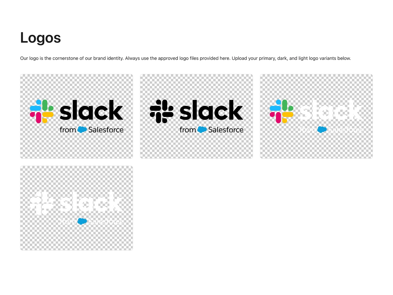
- Reversed and one-color: solid white and solid black versions, for dark backgrounds, single-color print, embroidery, and engraving.
State the default in one explicit sentence, because the default does most of the work: "When in doubt, use the primary logo in full color on a light background."
Which variants exist is a strategy decision, not a design afterthought. A brand that will live mostly on social platforms needs an icon-only version treated with as much care as the primary lockup. A brand that will appear on embroidered workwear needs the one-color version tested on fabric first. If you are drafting the guide before the identity is fully settled, a brand strategy template gives each variant a documented reason to exist.
Logo Spacing Guidelines: Clear Space That Survives Real Layouts
Clear space is the empty zone around the logo where nothing else may enter: no text, no photos, no other logos, no page edges. It is the most effective single rule for keeping a logo looking deliberate, and also the most commonly broken, because "leave some room" is not a rule. A number is.
The practitioner's trick is to define clear space using something inside the logo itself, so anyone can measure it without a spec sheet or a call to the design team.
The worked example: take the wordmark in your primary logo and measure the height of one letterform, for instance the cap height of the first capital. Call that measurement X. The rule is then X of clear space on all four sides of the logo. If the cap height is 40 pixels on screen, nothing comes within 40 pixels of the logo. If it is 2 millimeters on a business card, nothing comes within 2 millimeters. The reader never has to ask how much room is enough, because the logo carries its own ruler.
A rule you can copy: "Clear space equals the cap height of the wordmark, shown as X in the diagram, on all four sides. Text, imagery, other logos, and the trimmed edge of the page may not enter this zone."
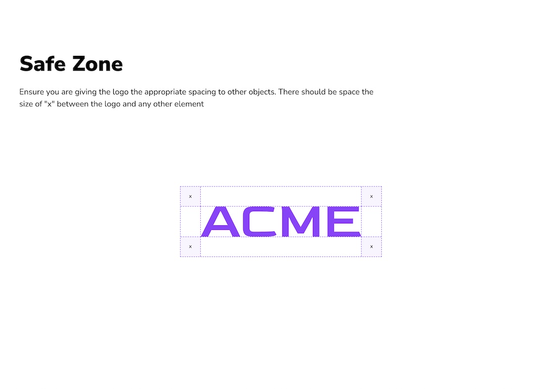
Set the distance to a partner logo in co-branded materials at the same time, commonly two to three times X, so the spacing rule already covers the co-branding case.
Enforcing the rule beats hoping for it. In Baseline, a published brand guide can carry a Logo Safe Zone block: you pick the logo, set the safe-zone size, and the boundary is drawn on the page for you, so the spacing rule survives contact with real layouts instead of living in a PDF nobody opens.

Logo Size Guidelines: Minimums for Print and Screen
Logos shrink badly. A lockup that reads clearly on a storefront becomes an unreadable smudge at 16 pixels, and whoever is placing it has no way to know where the floor is unless the guide states one. Logo size guidelines exist to draw that floor.
Rules worth copying as a starting point, then adjusting against your own logo:
- Print: the primary lockup never narrower than 15 millimeters (about 0.6 inches); the icon-only version never narrower than 8 millimeters.
- Screen: the horizontal lockup never narrower than 120 pixels; the stacked lockup never narrower than 96; the icon never below 24 pixels; the favicon at 16.
Test before you publish those numbers. Print the lockup at 15 millimeters and look at it from arm's length; render it at 120 pixels beside body text. If it fails, raise the minimum rather than hoping people will be careful. Minimums are promises, so make them ones the logo can keep.
Logo Placement Guidelines by Context
Placement is where logo guidelines meet everyday work, and where a general instruction like "place the logo prominently" falls apart. Each context needs its own line:
- Documents: in the header, top-left of the first page, or in the footer of the final page, never both and never on every page.
- Presentations: the title slide and the closing slide only, in the same corner each time. A logo on all thirty slides is background noise, not branding.
- Web: in the site header, aligned to its grid, linking home, roughly 24 to 48 pixels tall on desktop.
- Packaging: on the front face, aligned to the panel grid, clear space respected, never crossing a fold, seam, or seal.
- Social: icon-only as the avatar, the full lockup on covers and shared images, kept inside each platform's safe zone so crops do not clip it.
Two rules cut across every context. Same corner every time: consistent placement reads as confidence, roaming placement reads as decoration. And the logo sits on the composition's grid, never floating at a random distance from the nearest text block.
Color Variants and Backgrounds
State with pictures, not adjectives, which logo version appears on which background:
- Light backgrounds: the primary full-color logo. This is the default and should look like the default.
- Dark backgrounds: the reversed, all-white version, not a dimmed copy of the color logo.
- Single-color print, embroidery, engraving: the one-color version, black or white depending on the substrate.
- Photography: allowed only where contrast stays high; otherwise the reversed version sits over a dark scrim. If a photo is too busy for a scrim, the photo loses, not the logo.
One rule keeps all of this simple: the logo is never recolored to match a layout. The palette serves the logo; the logo does not adopt the campaign color of the month. If a special treatment is genuinely needed, a metallic foil version for instance, design it once, name it, and add it to the variants list.
Logo Misuse: Show the Don'ts, Not Just the Rules
Written rules tell, pictures convince. A red mark on each example does more for consistency than three pages of prose, because people recognize a pattern faster than they parse a rule. Show each don't next to its corrected do:
- Stretching or squashing to fit a space. The proportions are fixed; scale uniformly or pick a different variant.
- Recoloring outside the approved set. A color change is a new version that has to be designed and named first.
- Rotating or tilting for dynamic layouts. If the brand needs an angled application, design one on purpose.
- Effects: drop shadows, bevels, glows, outlines. The logo was drawn to sit flat.
- Busy backgrounds with no scrim or solid area behind the logo.
- Rearranging the lockup or retyping the wordmark in a similar font. If the horizontal version does not fit, the icon probably does; that is why it exists.
Keep the list to six or eight examples, one line each. The examples you skip are usually the ones your team actually commits.
File Formats: Which File for Which Use
The wrong file fails at the worst moment: the PNG goes ragged on a trade-show banner, the printer asks for a vector and receives a screenshot. Four formats cover nearly everything:
- SVG: the master vector for screen and interface work, infinitely scalable and small.
- EPS or PDF: the vectors for print vendors, packaging, signage, and stationery.
- PNG: transparent files for everyday documents, decks, and quick web placements.
- JPG: only where transparency is unsupported, and only on a matching background.
Add a naming convention and hold to it: brand, version, color, format, as in acme-logo-horizontal-color.svg or acme-logo-icon-white.png. A convention turns a folder of downloads into something a non-designer can navigate without opening files to check.
One more rule saves the most email: every file should be downloadable from the page where its rule appears. A reader who has found the right variant should be a few clicks from having it, not writing in to ask.
How to Keep Logo Rules Enforced After You Publish
Most logo sections are accurate on the day they ship and wrong within a year. The logo gets a refresh, the guide doesn't, and the old version keeps circulating in decks and vendor folders. Enforcement is what turns written rules into a brand compliance habit, and it rests on two things: one source of truth for logo files, and a visible approval step.
- One source of truth. Logo files live in one library, not in inboxes and not in a shared folder called "logos_final". Everyone, vendors and freelancers included, pulls from that source, with access scoped so outsiders see only what they need.
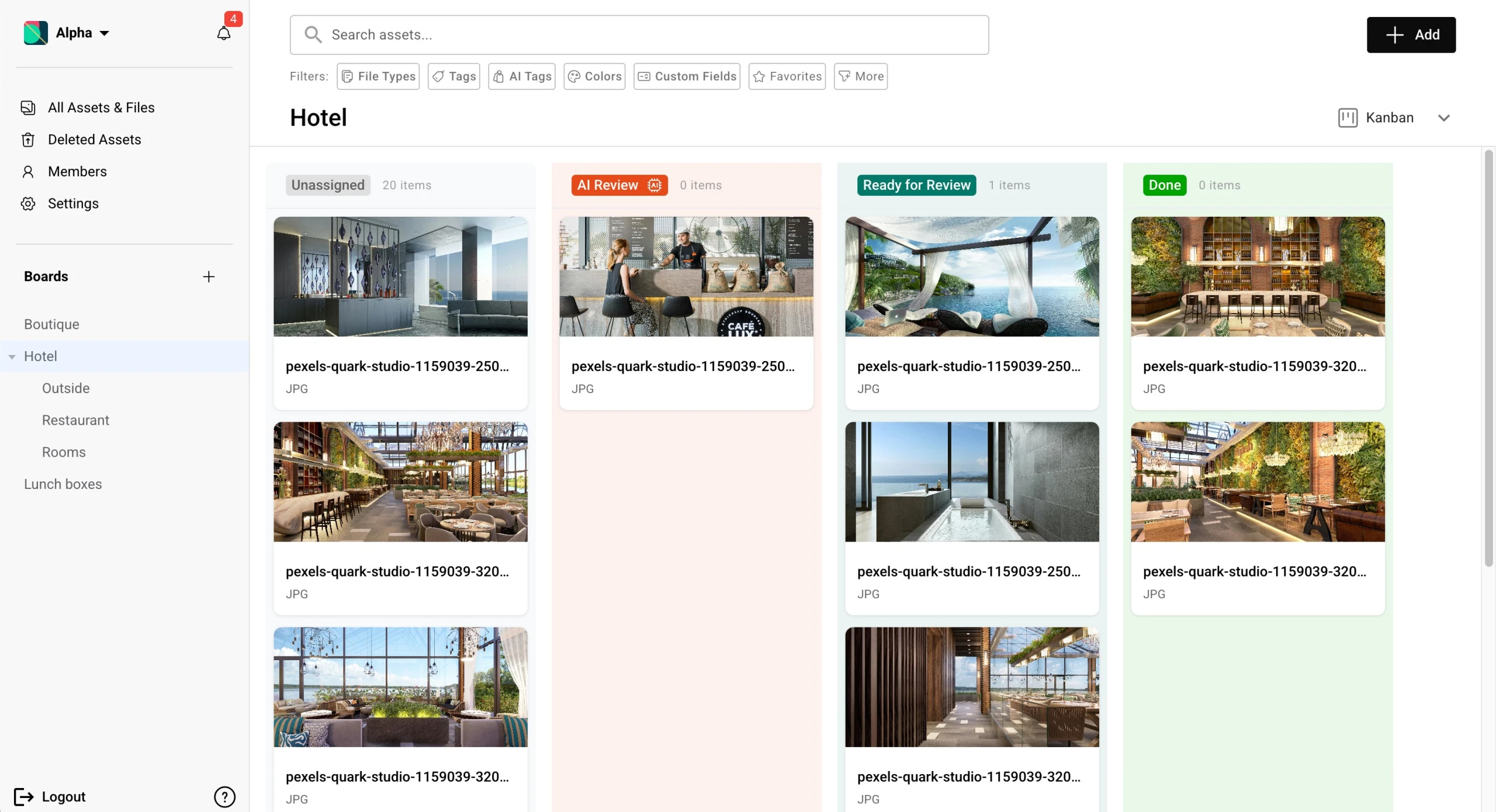
- A visible approval step. Give logo files an approval status, Draft, In Review, Approved, Rejected, and review new versions in a board grouped by that status. Approved then means something specific, because the board says so.
- Version control. When the logo changes, the new version replaces the old in the same place, and the old file stops being reachable as current. What changed, and when, is a matter of record rather than memory.
Who owns the yes is a brand governance question, and it deserves one line in the logo section itself: name the person who approves new versions and exceptions, so the rules have a referee.
How Live Brand Guides Keep the Logo Section Current
There is a structural problem with a logo section that nothing above can fix: a static guide is a snapshot. The moment the logo changes, every page built around it is out of date, and someone has to export new files, rebuild the document, and redistribute it. That is why so many guides simply go stale.
This is the problem Baseline was built around. Baseline is a digital asset management platform that also publishes your assets as live brand guides. The logo section of a published guide pulls its files straight from the asset library, so the guide is never a snapshot: update the logo asset once and the change refreshes everywhere the guide is published. Swap in a new primary logo, and every logo block that references it updates with no rebuild and no redistribution.
The same mechanics keep the rules themselves honest: a guide that pulls from a single library cannot display an outdated file, because there is only one version to display. For more, see how living brand guidelines work.
Frequently Asked Questions
What are logo guidelines?
Logo guidelines are the rules that govern how a logo may be used: which version, at what size, with how much clear space, on which backgrounds, and in which file format. They usually live in the logo section of a brand guide.
What should the logo section of a brand guide include?
Seven rule sets: named variants, clear space, minimum sizes, placement by context, color and background rules, misuse examples, and file format guidance. If every file is downloadable next to its rule, the section is complete.
How much clear space does a logo need?
The practical standard is the height of a letterform in the wordmark, often the cap height, applied to all four sides. Measure it once, publish it as X with a diagram, and anyone can check compliance by eye.
What is the minimum size for a logo?
Common starting points are 15 millimeters wide in print and 120 pixels wide on screen for a full lockup, with smaller minimums for the icon-only version. Test your own logo at those sizes before publishing the numbers.
How do I stop people from using an old version of our logo?
Keep one source of truth for logo files, make approval a visible step, and let version control replace the old file everywhere it lives. If your brand guide pulls from the same library, the guide itself can never be out of date.
Get Started
Write one rule this week: the clear space rule. It is the highest-leverage sentence in the logo section, it takes ten minutes with a ruler, and it prevents the most common misuse on day one. Everything else can follow next week.
When you are ready to publish the section somewhere it will stay true, Baseline turns your asset library into a live brand guide whose logo blocks update when the files do. Start building your brand guide or grab the free brand guide. The free plan has no trial countdown and no credit card.
Related reading: what a brand book is for where the logo section sits in the full document, what a brand kit is for the lighter package most small businesses actually start with, and brand governance for who owns the rules once they ship.