
Visual identity guidelines are the written rules for how a brand looks: which logo files to use and where, which colors are allowed and in what proportion, which typefaces speak for the brand, and how photography, icons, and layout hold it all together. Most brands have some version of these rules. Far fewer have rules a non-designer can actually follow, because most guidelines get written as inspiration documents: they show the brand at its best, but they do not tell a marketer building a slide deck what to do when the exact situation is not in the book.
The second failure mode is staleness: a guidelines PDF is a snapshot, the brand moves on, and an outdated guide is worse than no guide because people still trust it.
This guide covers what visual identity guidelines are, how they differ from brand guidelines and a brand book, the components of a visual identity system, how to write rules both designers and non-designers follow, and how to keep them alive instead of going stale as a PDF.
What Are Visual Identity Guidelines?
A visual guideline records the rules for every visible element of a brand: the logo, the color palette, typography, photography and imagery, iconography, and layout. They answer practical questions. Which file is the official logo? How much clear space does it need? Which blue is the brand blue, on screen and in print? Teams meet this document under several names, visual identity guidelines, a visual identity manual, corporate identity guidelines, or simply a style guide; the job is the same.
The audience is wider than most teams assume. Designers use the specifications, but marketers, sales teams, agencies, printers, and vendors all touch the brand without a designer in the room. Good guidelines serve that whole audience: specifications precise enough for professionals, and defaults plain enough that someone who has never met your brand team can produce on-brand work with only the guide in hand.
Visual Identity Guidelines, Brand Guidelines, and Brand Books
Brand guidelines cover the whole brand: visual identity, voice and tone, positioning, and usage rules. Visual identity guidelines are the visual subset: the rules for what the brand looks like, and nothing about how it sounds. Small brands usually keep both in one document and split them as they grow, because the visual rules change more often than the strategy does.
A brand book is the artifact that holds the rules, traditionally a designed PDF, sometimes printed, and we cover that format in what a brand book is. A brand kit is different again: the starter collection of assets themselves, logo files, color codes, and fonts, usually delivered without the written rules. The kit is the ingredients. The visual identity guidelines are the recipe.
The Components of a Visual Identity System
A visual identity is a system, not a pile of preferences. The colors depend on the logo, the typography sits next to the photography, and the layout rules give every component a predictable place. One rule applies to everything below: include the actual assets and values, not descriptions of them. A guide that says "our blue" without a HEX code, or "the bold weight" without the font files, is a mood board, not a guideline.
Logo Usage
Write the summary, not the encyclopedia. State which logo files exist, the primary logo, secondary marks and wordmarks, icons and favicons, and where each is used. Add the few rules that prevent the most common damage: minimum size, clear space, and which versions are allowed on dark or photographic backgrounds. Then stop. If your logo rules need more depth, and they usually do, that depth belongs in its own guide; we cover the full rule set, misuse examples, and file formats in logo guidelines. A short logo section gets read. A long one gets skimmed.
Color Palette
This is where specificity pays off most: for every brand color, publish the actual codes: HEX for web work, RGB for screens and video, CMYK for print, and a Pantone reference where print color matching matters. A printer cannot match "our signature teal". They can match a Pantone code.
Define the hierarchy, not just the list: primary colors, the one or two the brand is recognized by, which dominate; secondary colors, the supporting range for backgrounds, illustration, and data; and accent colors, used sparingly for calls to action. State the proportions so a layout does not end up half accent color. Many teams start from a 60/30/10 dominant, supporting, accent split and adjust; the exact numbers matter less than having numbers.
Cover accessibility here too: the Web Content Accessibility Guidelines set minimum contrast ratios for text, 4.5 to 1 for normal body text, so check brand text colors against their backgrounds. If a brand color fails as text, define an accessible variant and say when to use it rather than changing the brand. If the brand uses gradients, document linear or radial, direction, and color stops, so gradients do not drift into new combinations in every design tool.
Typography
Typography sections fail in two opposite ways: one typeface with no usage rules, or a font list with no explanation of how the pieces fit. The useful middle is a pairing with jobs: the typeface that carries headings, the one that carries body text, and what each is for. Then define the fallback stack, the system fonts that approximate the brand typeface, for people who cannot install or license it.
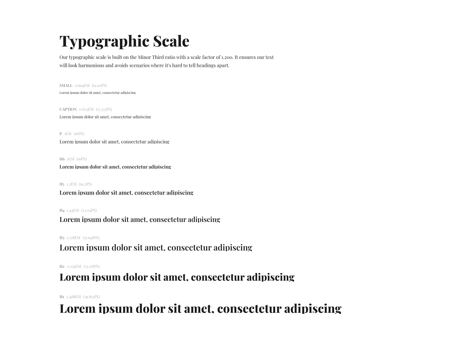
Define the scale as well: the actual sizes for display, headings, body, and captions, with weights and line heights. A scale turns "make the title bigger" into a decision anyone can make correctly.
Licensing is the part most guides skip, and it bites later. Fonts are licensed software, and a desktop license does not automatically cover web use or every template handed to a client. Write down where the licensed files live, who may use them, and what the free alternatives are.
Photography and Imagery Style
Photography is often the largest visual surface a brand has, and the least documented. Write the style in terms a photo buyer can act on: subject matter (people at work, products in context, no staged stock handshakes), light and mood (natural light, quiet backgrounds), composition (leave negative space for text), and color treatment (true to life, or a consistent grade). Include examples that pass, and a few that fail. And say where photography is not allowed; a rule like "no stock photos on the homepage" prevents more drift than any style description.
Iconography
Icons are small and drift fast, because anyone grabbing a free set under deadline pressure can change how a brand feels. Define the approved style: line or filled, corner radius, stroke weight, and sizes that align with the type scale. State where the icon library lives, when to use an icon instead of a photo, and keep one style per layout if icons come from multiple sources.
Layout, Spacing, and Grid
Layout rules are what make a dozen different deliverables feel like one brand. Define a spacing system, usually multiples of a base unit such as 8, so margins, padding, and gaps stay consistent across every tool. Define the grid for key formats: the columns, margins, and safe areas of a web page, a slide, or a brochure. State where fixed elements sit in standard layouts, where the logo goes on a slide, so a deck made by sales and a brochure made by an agency share the same bones.
Dos and Don'ts
Every component above produces rules. This section collects the most common failures as visual examples, right and wrong, labeled. People skim guides, and a labeled right-versus-wrong pair lands faster than prose. Keep the logo examples to the few most damaging ones, stretching, recoloring, busy backgrounds, and point to your logo guide for the full catalog rather than repeating it here.
How to Write Rules People Actually Follow
Components fail more often than they get chosen. The problem is usually the writing: rules written as descriptions instead of instructions. "Our logo should be treated with respect" is a description. Nobody can follow it, and nobody can enforce it. A pattern that works for every component has three moves.
Name the rule. One sentence, imperative, specific enough to settle an argument. "Use the stacked wordmark on dark backgrounds" is a rule. If two reasonable people could read it and make different choices, keep rewriting until they cannot.
Show the exception. A rule with no stated exceptions gets quietly broken, because reality produces situations the rule did not imagine. Write the bend in: "Use the stacked wordmark on dark backgrounds; when the background is a photograph, use the mono white version instead." Exceptions make a rule stronger, not weaker, because they prove it was written by someone who has done the work.
Show the failure mode. Pair the rule with what getting it wrong looks like. A designer sees a stretched logo and knows. A marketer may not. Visual don'ts teach the eye, and they make review conversations objective: feedback stops being "this feels off" and becomes "this is the don't from the guide".
One guide can serve both audiences, at different depths. Designers need specifications: codes, sizes, files, license terms. Non-designers need defaults: for slides, use this template; for text over photos, use white on the overlay. Put the quick rules first in each section, with the specifications beside them.
Then test the draft. Give it to someone outside the brand team with a real task: build a slide, pick a hero photo, brief a printer. Every question is a gap, and a section you now know how to write. Writing rules people follow is half the problem; the other half, checking that everyday work stays inside them, is brand compliance, which we cover separately.
Keeping Visual Identity Guidelines Alive
The lifecycle problem is structural. Guidelines are snapshots, and brands move: the palette gets refined, new photography arrives, a logo gets a cleanup nobody announces. A static guide cannot absorb any of it, and a guide people cannot trust is a guide they stop opening.
The fix is to publish the guidelines instead of exporting them. A live guide at a URL shows the current assets, because the images and swatches in it are the files themselves, not screenshots. It updates when the brand does, because it pulls from the asset library rather than a frozen export. And every rule has one address, so a discussion can link straight to the exact section instead of quoting it.
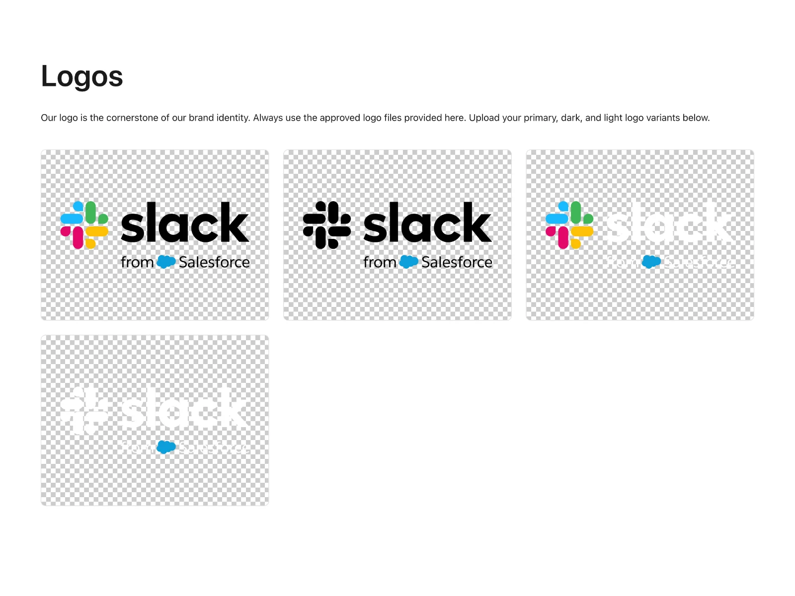
In a published guide, the logo section shows the approved files with their rules beside them, so what a person downloads is what the brand team approved.
The typography section shows the typefaces at their real scale, with weights and sizes specified.
The broader pattern is what we call living brand guidelines. The short version for visual identity: make the guide a view of your asset library, not a separate artifact somebody has to remember to update.
How Baseline Publishes Live Visual Identity Guidelines
Baseline is a digital asset management platform with publishing built in, which maps onto the two failure modes in this guide: rules nobody can follow, and documents that go stale.
The visual identity lives in the asset library first: logo files, complete font families, color palettes, and photography in one place, with version control so an outdated asset stops circulating as current. Fonts import directly from Google Fonts or Adobe Typekit. Color assets carry their own specifications: HEX, RGB, and CMYK values, Pantone references, and linear or radial gradients where the brand uses them.
Publishing turns the library into the guide. Start from a template with section presets for logo showcases, typography scales, and color palettes, then edit visually, dragging sections into place without code. Link a section to a board or an asset and it shows the latest approved version. When the palette changes in the library, the published guide refreshes wherever that palette appears.
Asset roles keep the connection precise. A role is a semantic label describing what an asset is for, like primary-logo, heading-font, or primary-color. Guide sections pull by role: reassign primary-logo to a new file and every section referencing it updates, no layout work. That is what makes the guide a view of the library rather than a copy of it, and a copy is exactly what goes stale.
Baseline's free brand guide is the fastest way to see the format, and you can start a brand guide from your own asset library. The free plan has no trial countdown and no credit card.
Frequently Asked Questions
What should visual identity guidelines include?
Seven components: a short logo usage summary, the color palette with codes plus hierarchy and contrast notes, typography with pairing, scale, and licensing, photography style, iconography, layout and spacing, and a dos and don'ts section. Include the actual files and values, not just descriptions.
How are visual identity guidelines different from brand guidelines?
Brand guidelines cover the whole brand: visual identity plus voice, tone, and positioning. Visual identity guidelines are the visual subset: rules for how the brand looks. Small brands usually keep both in one document and split them as the team grows.
Who are visual identity guidelines for?
Designers, and everyone who touches the brand without a designer nearby: marketers, sales, agencies, printers, and vendors. The guide works when a non-designer can produce on-brand work without asking questions.
How long should visual identity guidelines be?
Long enough to settle arguments, and no longer. A one-page guide people follow beats 60 pages nobody opens. The test: a stranger with a real task can finish it on-brand without asking a question.
How often should visual identity guidelines be updated?
Whenever the assets change: a refined palette, new photography, a logo cleanup. A live guide that pulls from an asset library updates continuously; a static guide needs a review schedule, or it circulates wrong assets with full authority.
Do small brands need visual identity guidelines?
Yes, and starting early is cheaper than repairing drift. A two-person studio still benefits from a short guide covering the logo, colors, and type. Start with one page and grow the guide when a real question arrives.
Get Started
Take one component, the color palette is usually the fastest, and write its rules this week with the three moves: name the rule, show the exception, show the failure mode. That section tells you how the rest should read.
If you want the guide to live somewhere it cannot go stale, start a brand guide on Baseline and publish your palette, type, and logo rules straight from your asset library. Related reading: what a brand book is for the format, logo guidelines for the logo depth we kept short, and living brand guidelines for the full pattern behind guides that update themselves.