Our branding platform provides contrast ratio measurements to help ensure your designs meet accessibility standards. This article explains how these contrast ratio measurements work and what they mean for your brand colors.
This article is also helpful to understand how contrast ratio works, even if you don't use our platform.
What is Contrast Ratio?
Contrast ratio is a measure of the difference in perceived brightness between two colors. It's crucial for ensuring text is readable against its background, especially for users with visual impairments. This will only continue to be more and more critical as companies are getting sued for failing to meet accessibility standards.
How We Display Contrast Ratio
For each color combination, we show a ratio followed by a pass/fail indicator, for example:
- Contrast 2.78 (FAIL)
- Contrast 3.53 (AA+)
Understanding the Ratio
The ratio is always expressed with the lighter color as 1, so a ratio of 3.53:1 would be displayed as "Contrast 3.53".
Pass/Fail Indicators
We use the following indicators:
- (FAIL): Does not meet minimum accessibility standards
- (AA): Meets minimum WCAG 2.0 level AA standards for large text (18pt+)
- (AA+): Meets enhanced WCAG 2.0 standards for normal text
- (AAA): Meets the highest WCAG 2.0 level AAA standards

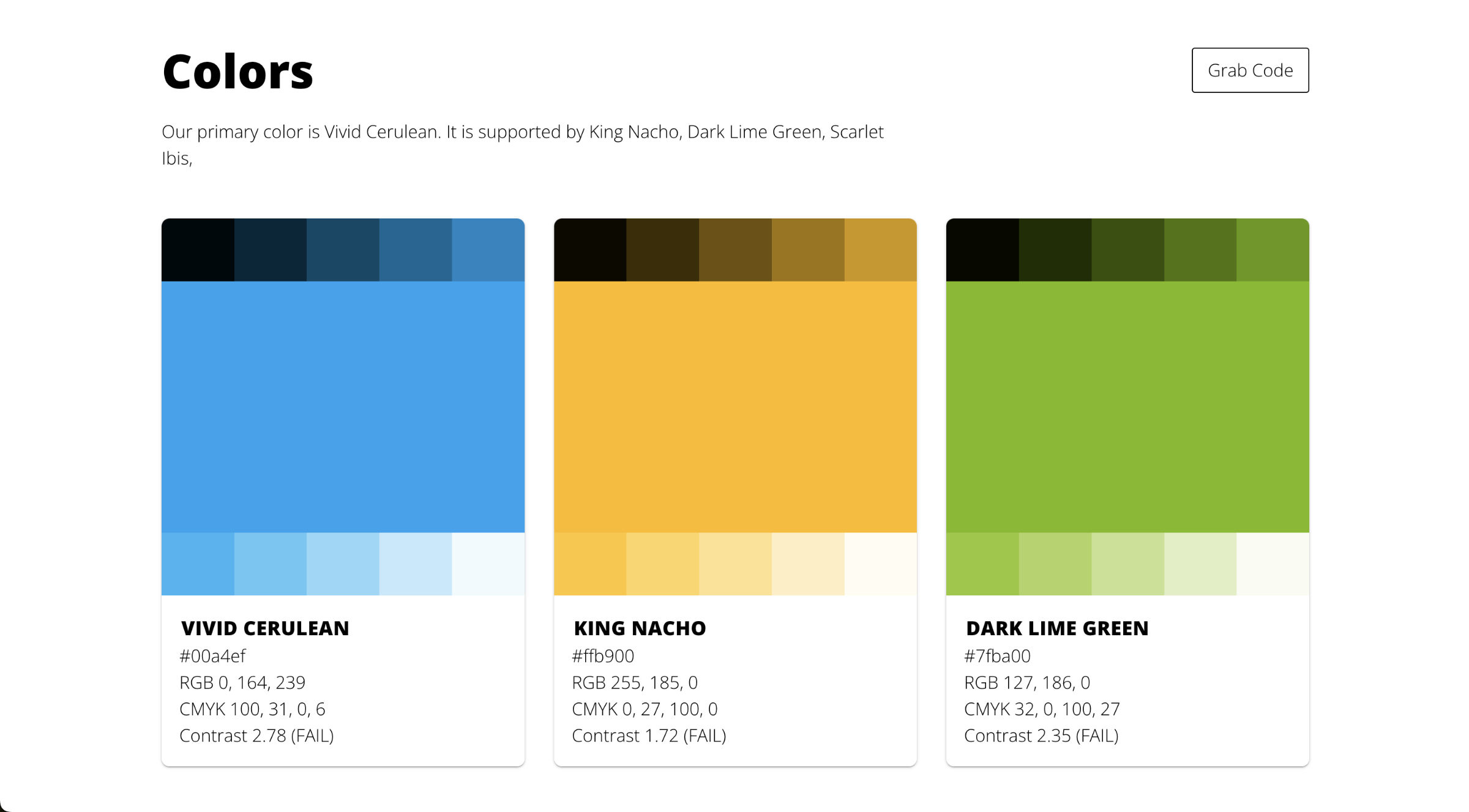
Brand Palette Contrast
For each color shade and hue in your brand palette, The Baseline brand guide displays its contrast ratio against black and white. This helps you quickly identify which background colors work best with dark or light text.
Contrast against black is displayed as black text on top of the shade or hue, and against white is displayed as white text. When the number is too hard to see, you know the ratio is definitely bad, so I advise against using it.
Why Contrast Matters
Adequate contrast ensures that your content is readable by as many people as possible, including those with visual impairments or color blindness. It's not just about accessibility—good contrast can improve readability and user experience for everyone.
Using This Information
Use these measurements to:
- Choose appropriate text and background color combinations
- Ensure your designs meet accessibility standards
- Make informed decisions about which colors to use for different elements in your design
Remember, while meeting standards is important, it's also crucial to consider the overall visual design and user experience of your product.